Exploring IRIS Data and Data Quality with QUACK
Introduction
Since Summer 2003, data flowing through the IRIS DMC’s near-real time data collection systems (BUD and USArray) have been analyzed by an automated software package known as QUACK (Quality Analysis Control Kit). QUACK measures quality parameters such as noise level, data availability and data latency. The quality parameters measured by QUACK are stored in a relational database. Internet users can explore and view measurement parameters made by QUACK via a user interface. Additionally, QUACK includes an e-mail reporting mechanism, targeted at network operators.
The Framework
At the heart of QUACK is a software framework that orchestrates the operation of specialized software “plug-ins”. On a daily basis, the plug-ins scan the online data and return quality measurements back to the framework. The framework is then responsible for storing those results in a relational data base. Currently, there are 9 operational plug-ins:
| Name | Function |
|---|---|
| RMS | Measures daily signal mean and variance |
| Checkname | Does a sanity check on files making sure that the data in the files matches the name of the files. |
| Biner | “bins” count levels to determine how many unique count levels there are in a day of data. This is useful in detecting dead channels since dead channels will often have a low number of unique values over a day. |
| Latelet | Measures data latency. (Runs six times per day). |
| Timerlet | Attempts to identify data timing problems. |
| Gap | Looks for gaps and overlaps in miniSeed data. The plug-in also measures what percent of the day has data. This is useful for identifying connectivity issues. |
| Deadlet | Detects dead channels by recording the maximum interval of time for which the count value stays constant. |
| StaLta | Measures the Short Term Average to Long Term Average ratio. |
| Pdflet | Using code developed by Dan McNamara and Richard Boaz, measures the Power Density Function. |
The plug-ins are generally run once a day. The exception to this is the latelet which measures data feed latency. It runs 6 times per day.
QUACK web interface
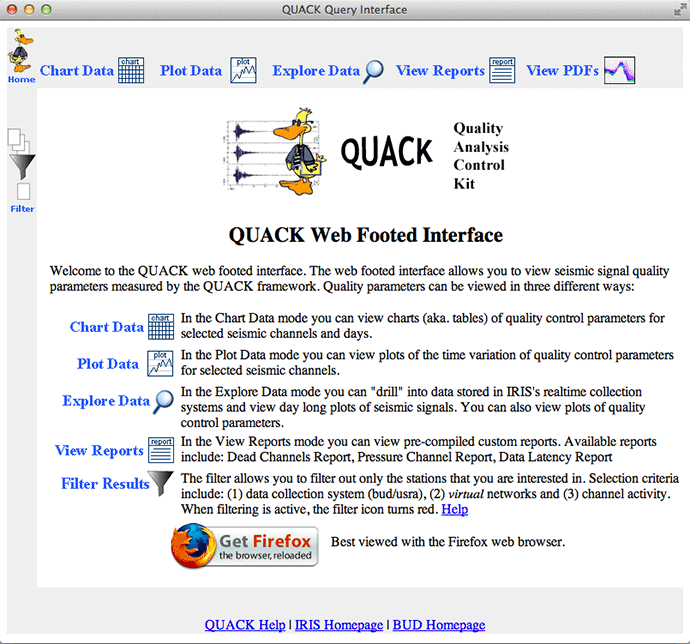
The QUACK web interface provides web users with a set of tools for viewing data measurements generated by the QUACK framework. The web interface can be quickly reached from the QUACK link located at the bottom of the main IRIS web page. Or you can get there directly at: http://ds.iris.edu/quack.
Modes of operation
The web interface has five modes of operation:
Chart Data
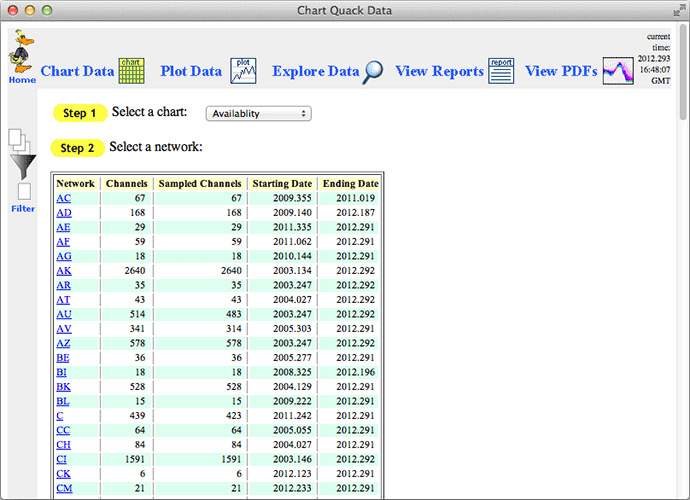
In chart mode you can view related groups of quality parameters for a chosen date measured from a set of channels from one network. Available charts include Availability and RMS & Average.
Plot Data
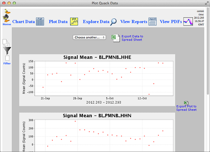
Plot mode allows you to view plots of:
- Daily Signal RMS
- Daily Signal Mean
- Daily Percent Availability
- Number of Gaps Per Day
- Number of Overlaps Per Day
- Max Overlap
- Max Gap
for a set of channels from a given network over a given time range.
Explore Data
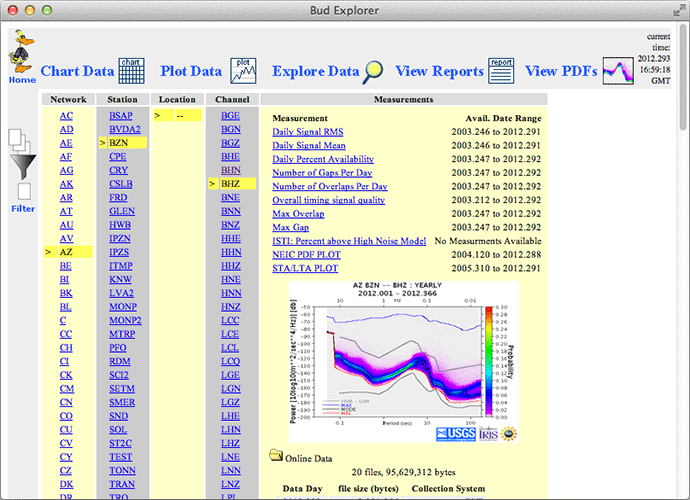
Explore mode allows you to quickly “drill down” to a particular seismic channel and view quality parameters associated with it. In explore mode you can also view online data in the near real-time buffers. This is done by selecting a network, station, location, channel quadruplet and a data date (for example 2006.070). You can then view:
- metadata (including response data)
- parsed first miniSEED header
- simple plots of a day of data
- webicorder view of a day of data
- plots of logical record start time vs logical record number for a day of data
- plots of logical record sequence number vs logical record number for a day of data
You can also customize all these parameters in the URL query (web address).

View Reports
Report mode is a catch-all for displaying QUACK quality parameters. Currently, there are three reports available:
- Dead Channels Report
- Atmospheric Pressure Channel Report, and
- Data Latency Report
The Dead Channels Report shows webicorders of all of the channels exhibiting low numbers of discrete sample levels as determined by the biner plug-in mentioned earlier.
The Pressure Channels Report shows plots of average signal levels for the last year for atmospheric channels.

The Latency Report allows you to view network and station data latency over the previous week for any network or station. This should be of interest to network operators.
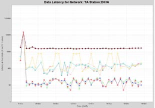
Data latency is measured as the time difference between (1) the time when a latency measurement was made and (2) the time of the newest digitized sample received at the IRIS DMC for a given channel at the time of the measurement. If a channel is not seen for more than one week, no more latency measurements are stored until it reappears.
In order to decrease clutter, at the network level, only the lowest latency channels are displayed (one from each station). At the station level, all channels are displayed.
The vertical axis of the latency plots are logarithmic. The scale ranges from 1 second to 604,800 seconds which is one week. Currently, the latency plots show latency over the most recent week. Future versions of the web interface will allow longer time ranges to be displayed.
View a current snap shot of data latency.
View PDFs
Perhaps the most interesting capability of the QUACK web interface is its ability to show PDF (Power Density Function) plots. PDF plots are histograms of hourly PSD (Power Spectral Density) estimates.

PDF plots are useful for characterizing the noisiness of a channel. In PDF mode it is possible to view how the PDF characteristics vary with time. There are two ways of doing this:
(1) Sub-Interval Display
As you drill down into the PDF plots you are shown cumlative plots for (a) all time, (b) years, (c) months, (d) weeks and (e) days. At any given level (except days) you are also shown plots for all of the sub-intervals. For example, if you are at the year level you will be shown the PDF plot for the whole year and the PDF plots for all of the months which make up this year. This can be very useful for determining when, for example, a channel went dead.
(2) Clickable PDF Plots
At any given time interval level (all, year, month, week or day) you are presented with a link that will take you to a clickable PDF plot (see the above example). If you click on a region within this plot, server side code will search through all of the PDF data and determine which, if any, hourly time intervals were responsible for generating the clicked upon feature. The above example, yielded the following plot:
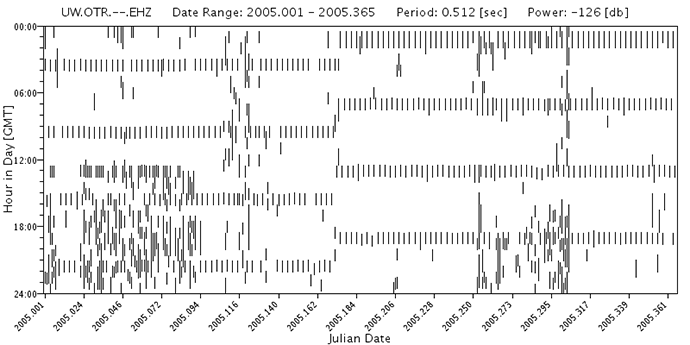
In this plot the vertical axis is time of day (GMT) and the horizontal axis is date. For the given example the horizontal axis covers a year. For the given example the high noise feature appears without a time of day dependency, but only during the winter months. This station is located on the Olympic Penninsula of Washington State and this noise feature is probably weather related. The horizontal, strongly correlated with time of day, features are probably caused by calibration pulses coming from the instrument itself.
Additional Information
Seismic Noise Analysis System Using Power Spectral Density Probability Density Functions: A Stand-Alone Software Package By D. E. McNamara and R.I. Boaz
http://pubs.usgs.gov/of/2005/1438/
http://geohazards.cr.usgs.gov/staffweb/mcnamara/Software/PDFSA.html
Filter Results
The web interface provides a filtering capability which is useful if you want to restrict what data to display. For example, you maybe only interested in viewing channels which are currently active in the near real-time data buffers. It also allows you to restrict your selections to data coming from virtual seismic networks such as the GSN network.
Email Reports
Part of the QUACK suite of programs is an e-mail reporting mechanism. The reporting mechanism sends daily reports to subscribers. Subscribers are typically network operators. Users can subscribe to individual networks or all networks. A sample report is available here.
If you are interested in subscribing, please send e-mail to bruce@iris.washington.edu
Future Work
QUACK is a work in progress. In the near future we will be adding the ability to view results from the StaLta plug-in which has been operational since the fall of 2005. We also will be working on improving the reporting mechanism to help identify data problems more quickly.
by Bruce Weertman (IRIS DMC)


